




Screen Tints
Using screen tints of the official university colors in any combination is unacceptable.
The guidelines outlined herein must be meticulously adhered to uphold consistency, thereby ensuring alignment of all brand-related materials with the intended visual and messaging characteristics.

Use the original, high-quality graphic files and do not change them. Do not scan or recreate the logo. Do not use bit mapped images such as TIFF or PACT file formats for offset printed materials because of their poor reproduction quality.
High-quality files can be downloaded from the Fluent Brand Library. By downloading the logo, you are agreeing to abide by the university standards within the brand guide.
The EPS file format is scalable for high-quality reproduction. Do not create additional file types, like SVG for the logos as these are not approved. PNG files are primarily used in digital materials.
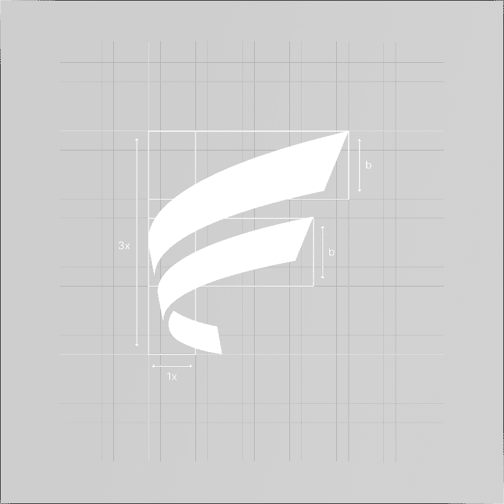
The brandmark is built with the initial letter in the brand's name. It can be used in many ways due to its integrity. However, it is important that the appearance of the brandmark remains consistent. As indicated in this document, there are no exceptions.
You can easily recognize the letter F by taking a look at the brandmark. It is a strong key visual that is memorable and simple. The position and proportion of the logo are strictly fixed. They must not be changed or redrawn for any reason.
Never reproduce the logo at a size smaller than these recommendations, as it will result in the loss of their impact and readability. The full logo should never be smaller than 90px wide for digital reproduction and a size of 5/16" for print production.


The area of clearance is a protected space around the logo where no other elements should appear. This ensures the logo remains visible and maintains its integrity in every application.
The height of the F brandmark is represented as “x.” A clearance of 1/2x on each side is the standard isolation area that must be maintained around the logo at all times.
Where space is limited by ad specifications, the isolation area can be reduced to 1/3x on each side if necessary. However, 1/2x clearance remains the preferred standard whenever space allows.



The logo should only be reproduced in its official colors. Do not alter, tint, or apply unapproved color treatments to any version of the mark.
Blue and black versions are the preferred options for most applications. Use the white version only on approved dark or photographic backgrounds.
The logo may be embossed or debossed when the production method supports it. For metallic or specialty finishes, refer to the Color Palette guide section.
The logo should be placed in the top left or bottom left of the layout whenever possible. It should never be smaller than 90px wide in digital applications.
Using screen tints of the official university colors in any combination is unacceptable.
Mixing the official colors in any combination other than the approved usage is unacceptable
Rearranging the logo and wordmark configurations in any way is unacceptable
Replacing the logo with the official font or any other font is not acceptable.

Do not add a shadow or dimension, or distort the logo or signature.

Using low-quality graphics is unacceptable. The logo should never be blurry
Do not angle or rotate the logo or signature.
Changing the spacing between the wordmark and logo is unacceptable.
Changing the dimension of the logomark or wordmark is not acceptable in any way.
Do not use only wordmark in any case as it is not acceptable must always include logomark.
Applying a gradient on the logo is not acceptable logo must always remain as stated in the guide.
When using the configurations over a photograph, the logo must be either blue or black or reversed to white. The placement of the logo should be in an area of the photograph where there are no distracting patterns or elements. When using the white logo, the photograph should be seen through the F logo mark.

Blue logo on a photo with no distracting elements

White logo on a dark photo

Black logo on a clear and bright photo

Logo on distracting patterns or elements

Black Logo on dark photos and distracting patterns

Low contrast image with a distracting element
When placing a Fluent logo on a solid background color, the accessibility of the combination of logo and background color must be accessible. Avoid using light logos on light backgrounds or dark logos on dark backgrounds.
Blue logo on white background
Black logo on white background
Black logo on white background
White logo on blue background
White logo on light background colors
Black logo on blue background
Icons help users identify categories, navigate information, and support visual consistency. Fluent uses a custom icon set available in the brand asset library. New icons may be created by units, submitted for approval, and added to the collection. Avoid using stock icons or assets outside the approved brand collection.
When designing new icons for your unit, it is essential to follow best practices and consider the following parameters:

The illustrative icons are based on a clear, plane, and linear style. The story is always represented with an action or movement to express a nimble and swift feeling linked with our value of innovation/doers.
The color is always used to highlight key sections of the illustrations. Besides, it delivers a combination of fresh and elegant sense without overusing our blue corporate color.

Here at Fluent Conveyors, we have a collection of mechanical drawings we incorporate in our print and digital design to reflect our core brand quality visually, this mechanical drawings are produced internally and only available to units for use, this is an example of one of our drawings which combines various technical lines and mechanical measurements.

We have a additional elements assets and textures that complement our brand and can be used as design elements on social, web and print media alike.


Discover how Fluent Conveyors brings its identity to life across every touchpoint. Exploring our brand allows teams, partners, and clients to better understand how consistency, clarity, and design work together to create a unified experience across all applications.
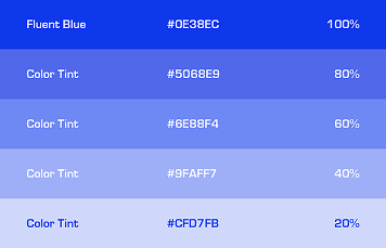
Our color system extends the brand identity, reinforcing recognition while maintaining a professional tone.

At Fluent Conveyors, we value clarity and partnership, building communication that supports shared success.

Media highlights the performance, precision, and reliability of Fluent Conveyors.


Copyright © 2025 Fluent Conveyors, LLC. All right reserved

Fluent Conveyors logo is a registered trademarks of Fluent Conveyors, LLC. Serial Number 97664258 Registered on Dec. 12, 2023