
Color

The Fluent Conveyors color palette emphasizes clarity, reliability, and strong brand recognition.
The Fluent Conveyors color palette emphasizes clarity, reliability, and strong brand recognition.
Here you can take out the approximate values of the Fluent blue color tints when applying the the color for either print or digital work. The percentages of blue represent shades of the color approved for use when representing the brand on any medium.
Fluent Blue and Fluent Black are recognizable as brand-specific colors and should be firstchoice considerations when selecting color elements for your project.
Fluent White serve as foundational contrast colors that allow blue and blue to shine. Unless printing in one color (black ink), black and white should not be used without a primary brand color — Fluent Blue to represent the brand.
The above is Fluent black, based on values of the Fluent blue we developed a seven-step scale, Fluent Grey and White are part of this scale. To improve accessibility and readability for all sighted readers by reducing contrast, Gray 1 is used as black and Gray 7 as white.
Fluent Blue
HEX: #0E38EC
RGB: 14, 56, 236
CMYK: 92, 78, 0, 0
Fluent Black
HEX: #000000
RGB: 0, 0, 0
CMYK: 0, 0, 0, 100
Here you can take out the approximate values of the color proportions within a layout on a white background when applying the Brand Palette. The percentages of black in this case would be formed by text and the Fluent Conveyors logo while blue is reserved for the isotype or is used as an accent color.
The values shown are just rough guidance and may vary on different applications or for different purposes. For instance, using a mainly dark or black background image for a premium roll-up banner would imply swapping the black and white values.
20%
Accent
30%
Second
50%
Second
This palette will be used to support further corporate and commercial communications. The accent colors boost communication and empower the brand DNA to fulfill a boldness and innovative brand design attitude. These colors can be used in different proportions taking into account the objective of the publication/communication.
Fluent Orange
CMYK: 0, 48, 88, 0
RGB: 255, 153, 51
HEX: #FF9933
Fluent Green
CMYK: 81, 6, 72, 0
RGB: 0, 169, 118
HEX: #00A976
Fluent Red
CMYK: 11, 96, 77, 2
RGB: 212, 46, 64
HEX: #D42E40
Fluent Cyan
CMYK: 69, 10, 0, 0
RGB: 14, 179, 236
HEX: #0EB3EC
In the Fluent Conveyors brand identity, secondary colors are intentionally limited in use to preserve visual consistency and uphold brand integrity. These colors serve a supportive role—enhancing visual hierarchy, improving readability, and distinguishing between categories or interface elements when the primary palette is not sufficient on its own. They are not meant to be dominant, but rather to subtly reinforce organization and structure in designs that involve layered communication.
Secondary colors should be applied with precision and intent—never as mere decoration or visual filler. Their use is most effective in complex visual systems, such as technical documentation, web and digital interfaces, or product segmentation. For web design specifically, secondary colors may utilize percentage tints to create subtle variations in tone without compromising brand cohesion.
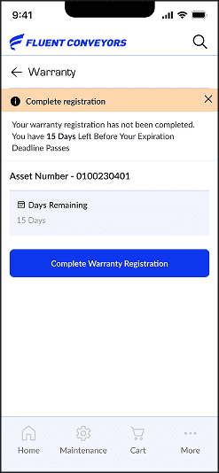
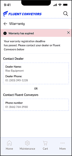
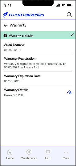
Please note the specific color values set for digital, print, and specialty printing. They have been chosen based on review and prototyping, we continue to review them and we're still dialing in the color values with our trusted vendors and partners, we will update changes here.
Coated Print - Fluent Blue
Pantone 2728C
Coated Print - Fluent Black
Pantone Black 6C
Uncoated Print - Fluent Blue
Pantone 286U
Uncoated Print - Fluent Black
No Pantone
Metallic ink colors are sophisticated and powerful and used only in print applications.
Still working on the formation of better gradients, color combinations, and a guide to ensure consistency of use will be available soon.
Foil stamping is a specialty printing process that uses heat, pressure, metal dies, and a thin sheet of metal foil film. We use either blue or light grey (as metallic silver) when replacing colors in the Fluent logo (may not be all blue or all light grey).
Metalic Blue
Pantone 8185C
Metalic Orange
Pantone 8962C
Metalic Green
Pantone 8401C
Metallic Red
Pantone 8740C
Metallic Grey
Pantone 8740C
Madeira Classic Rayon 40 — #1266 “Regal Blue”
This section defines approved cross-brand equivalents for Madeira Classic Rayon 40 color #1266 “Regal Blue.”
Use these references when substituting thread brands. Always verify through physical thread charts or a test stitch-out before production.
| Brand / Line | Fiber Type | Code | Color Name | Notes |
|---|---|---|---|---|
| Madeira Classic Rayon 40 | Rayon | 1266 | Regal Blue | Base reference color |
| Isacord (Amann) | Polyester | 3335 | Flag Blue | Newer chart match; older chart lists 3612 "Starlight Blue" |
| Robison-Anton | Rayon | 2627 | Pro Royal | Closest match based on color distance analysis |
| Floriani | Polyester | PF0368 / PF0366 | Royal Blue / Bluejay | Both within the same hue range |
| Brother / Simplicity Pro | Polyester | 406 | Ultramarine | Within the nearest blue color cluster |
Note: Variations may occur due to dye lot differences, fiber composition, and thread sheen. Always perform a stitch-out test to confirm the match under intended lighting and material conditions.
Inspired by industrial environments, this color palette reflects strength, precision, and durability through bold, functional tones. The combination of deep neutrals, metallic shades, and high-contrast accents creates a strong visual identity rooted in engineering and heavy industry.
Designed to perform across both digital and physical applications, these colors enhance clarity, reliability, and professionalism. The palette supports a modern industrial aesthetic while maintaining strong visibility and consistency across all branding materials.
Red
SFTRED
CMYK: 12, 96, 100, 3
Yellow
SFTYELLOW
CMYK: 1, 14, 88, 0
Green
Pantone 8401C
CMYK: 87, 31, 76, 18
Blue
Pantone 299
CMYK: 76, 24, 1, 0
Orange
SFTORANGE
CMYK: 9, 65, 100, 1
Discover how Fluent Conveyors brings its identity to life across every touchpoint. Exploring our brand allows teams, partners, and clients to better understand how consistency, clarity, and design work together to create a unified experience across all applications.
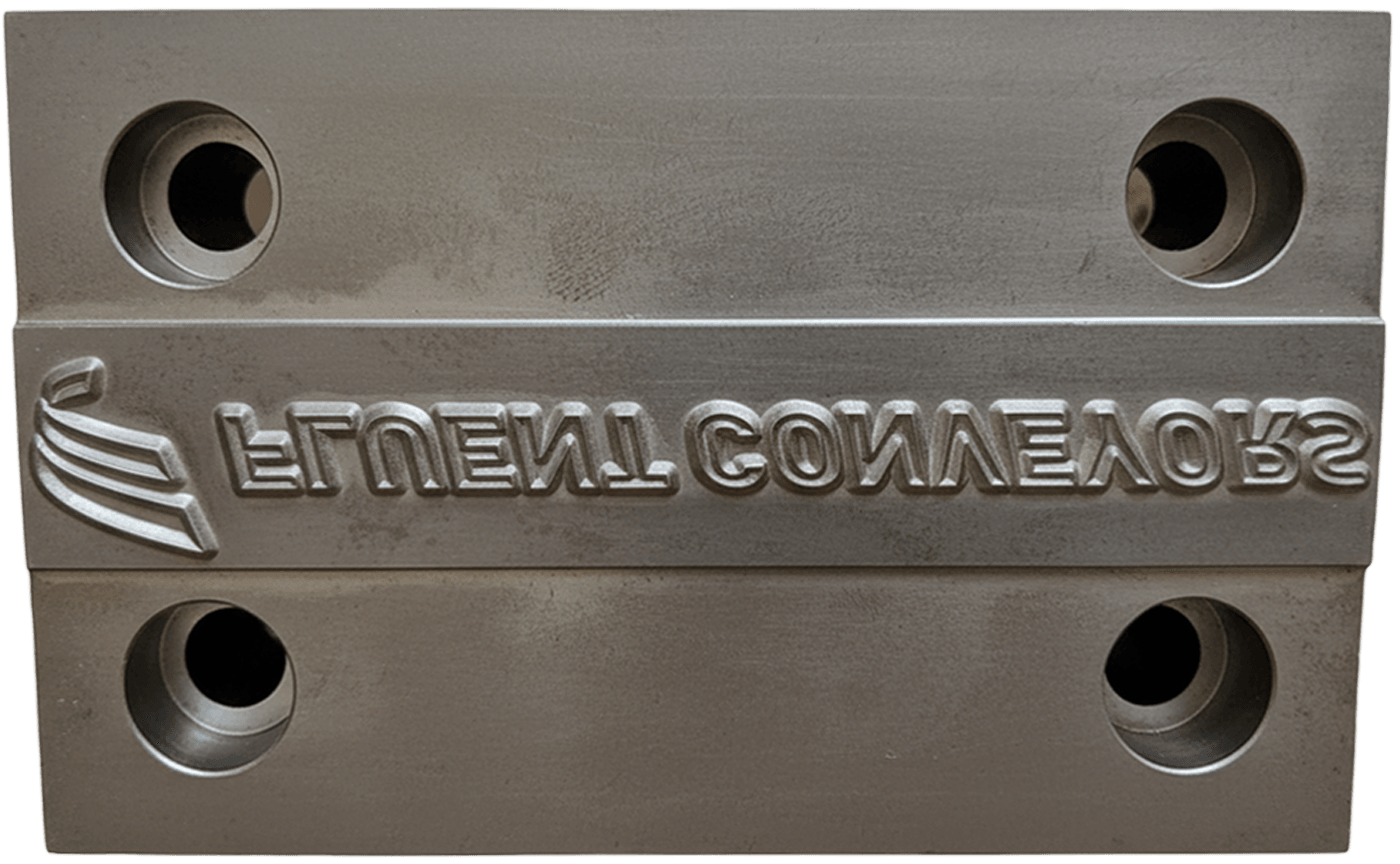
Consistent execution ensures every application reflects the Fluent Strategy with accuracy and discipline.

Our brand elements come together to create a consistent, recognizable system across every application.

Fluent Conveyors is a leading engineering brand focused on performance, reliability, and long-term value.


Copyright © 2025 Fluent Conveyors, LLC. All right reserved

Fluent Conveyors logo is a registered trademarks of Fluent Conveyors, LLC. Serial Number 97664258 Registered on Dec. 12, 2023