Typography

Typography

Typography

Fluent Conveyors is first and foremost. We are expected to use proper grammar, punctuation, letter case sizing standard rules of the English Language.

Primary Font

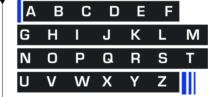
Eurostile

Eurostile is the standard and main font used for print, video, and all Adobe software uses. It may be used in all media, including items for sale. All Fluent Conveyors staff may use the font in software that is connected to Adobe Fonts for all creative and communications applications, delivering on our goal of inclusion and collaboration within and across units.

  • Square geometric design: Strong rectangular forms suited for technical, futuristic, and industrial themes.
  • Wide letterforms: Creates a bold, modern look with improved display legibility.
  • Distinctive uppercase styling: Characters like "A," "E," and "R" give Eurostile a recognizable high-tech feel.
  • Multiple weights and styles: Available from Light to Black in regular and oblique versions for flexible hierarchy.
  • Extended and condensed families: Includes Extended for impactful headings and Condensed for compact layouts.
  • Sans-serif modernism: Blends Swiss design influence with sci-fi aesthetics for UI, signage, and branding.
  • Regular: Used for pull quotes and recommended for body copy.
  • Bold: Used for headlines and subheadlines for clear hierarchy.
  • Black: Recommended for primary headlines with maximum impact.
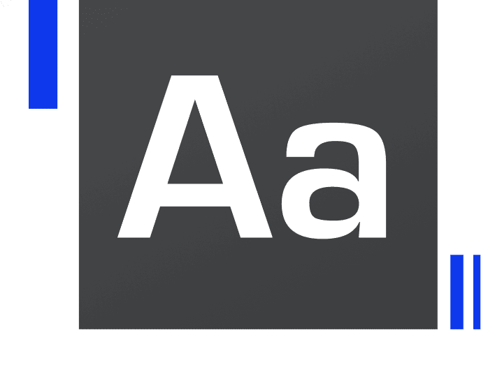
Eurostile uppercase alphabet specimen

System & Digital Font

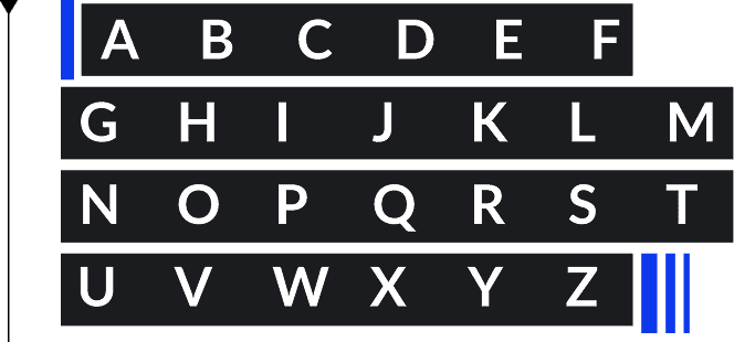
Lato

If you don't use Adobe Creative Cloud in your day-to-day work, or if you're working in an application that does not offer Eurostile as an option, use Lato. This font does not require additional licenses and is considered a system font that is loaded on a variety of systems. By using this font, you can be assured that it will render accurately with exchanging documents with colleagues, students, and other stakeholders.

Where To Use Lato

  • Microsoft Office or Google Docs.
  • Email (Outlook, Gmail, and Sales Force Marketing Cloud).
  • When using any software that doesn't offer Eurostile as an option.
  • asu.edu: The chosen webfont for ASU websites is Eurostile.
  • When developing websites, use Arial, Helvetica, and Sans-serif as your font stack.
Lato uppercase alphabet specimen

Formatting Tips - Headline

Font Size

No fixed rules for headline sizing. Use judgment to match the brand’s tone: big and bold conveys presence and authority.

Capitalization

Use title or sentence case. All caps are not part of the core brand voice. Reserve small-caps for complex documents where they clarify structure — never as a stylistic choice.

All headlines should be in sentence case — capitalize the first letter and all proper nouns. Exception: the first word after a colon is always uppercase.

Alignment

eft-aligned body type is easiest to read. Small paragraphs or headlines may be right-aligned to fit the layout. Avoid center alignment.

Font Color Headlines

Black on white (or white on dark) is the primary choice. The only other approved headline color is Fluent blue — part of the core palette and strictly reserved.

What Not to Do with Headline Formatting

  • Don't: Scale type horizontally or vertically.
  • Don't: Use a strong drop shadow.

Formatting Tips - Body Copy

Fluent Conveyors is first and foremost. We are expected to use proper grammar, punctuation, letter case, and standard rules of the English language.

Italics in Body Copy

Italics should not be used for text. See Formatting, Titles for details.

Font Size for Body Copy

  • 7.5-12 pt is acceptable.
  • 9 pt on 12 pt leading is a solid starting point for readability.
  • Consider your audience when choosing size.
  • 12-14 pt is better for older audiences and vision impairments.
  • 8-10 pt suits younger audiences.

Font Weight in Body Copy

Eurostile Regular or Light are the preferred font weight choices for body copy.

Highlights

To emphasize words in Eurostile Regular paragraphs, use bold for legibility. For large blocks, bold the specific words. You may also use corporate blue while keeping recommended weights.

Hyphenation

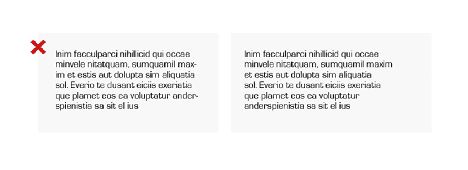
Never use hyphens. Removing them improves readability and aesthetics.

Hyphenation comparison example

Typesetting

Typesetting plays a crucial role in enhancing the legibility of text, making prioritizing optimum readability essential. It is important to invest in effective typesetting for an improved reading experience.

Tracking and Kerning

  • Tracking refers to the total spacing of a block of copy.
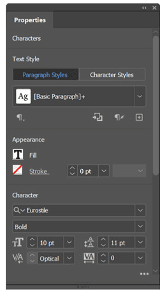
  • Eurostile is bold and tight by default so the recommended tracking is at 0 of em nothing more or less is accepted
  • Kerning refers to the space between individual letterforms.
  • Beyond tracking, attention to spacing between letterforms needs to be taken into consideration. This recommended setting for this is set at “optical”

Drop Shadow

Drop shadows are not preferred within the Fluent brand expression. However, subtle shadows or outer glows may be used when needed to improve legibility against complex backgrounds, textures, or photography.

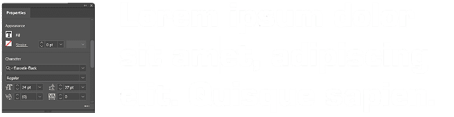
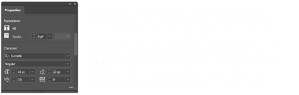
Kerning recommended settings panel
Tracking recommended settings panel
Correct leading on headline example

Example of correct use of leading on headline

Leading too tight on headline example

Example of leading that is too tight on headline
Correct leading on body copy example

Example of correct use of leading on body copy

Leading too loose on body copy example

Example of leading that is too loose

Leading

Leading is the space between lines of text and is measured from baseline to baseline of each sentence. This is a variable that will largely depend on your project requirements.

  • Leading should be between 2–3pt above the font size as a general rule.
  • Example: 10pt Eurostile Regular type is most readable with 12, 13, or 15pts leading.

Things to Consider:

  • The looser the leading, the harder the copy can be to read. The same holds true for tight leading.
  • Tighter leading has the unintended consequence of adding tension to a large body of copy.
  • Is the body copy intended to be more decorative? Loose leading is less of a consideration.

Spacing and Hierarchy

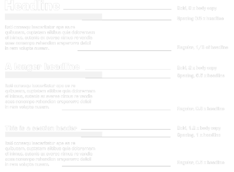
The diagram below illustrates the recommended way of spacing headlines and body, though there are no specific requirements for the sizing of fonts use judgment when considering what size font to use.
Spacing and Hierarchy
Column width diagram

Column Width

In Western language typesetting, the guiding principle for maximum readability is a line of type that is less than two alphabets long.

For print: Keep column widths in print publications to fewer than 52 characters makes for easy reading for our audiences.

  • Narrower columns are recommended to help audiences read text quickly and begin acting on the messaging. When setting wide columns, a few points of additional leading make the long line easy to read.

Accessibility

Spacing and Hierarchy

  • Normal text: minimum 4.5:1 contrast ratio (WCAG AA).
  • Large text (18px+ bold / 24px+ regular): minimum 3:1.
  • Never go below 16px for body copy in desktop digital interfaces.
  • Test with axe, Lighthouse, or native dev-tools contrast picker.

Motion & Cognitive

  • Respect prefers-reduced-motion before animating type or using variable-font axis animations.
  • Avoid justified text; uneven spacing creates “rivers” that dyslexic users struggle with.
  • Never rely on color alone to convey meaning. Pair with icons, text labels, or patterns.

Don't

Use placeholder text as the only form label. It disappears on input and fails WCAG 2.1.

Do

Allow browser zoom up to 200% without horizontal scrolling. Build with relative units: rem, em, and ch.

UI Typography

Forms

  • Left-align labels and inputs for fastest scanning.
  • Error text: 14px minimum, high-contrast red + icon, placed immediately below the field.

Components

Use ALL CAPS for button labels, bold, at 16–18px. Sentence case should only be used for secondary text or supporting labels.

Data & Tables

  • Right-align numerical data; left-align text.
  • Use tabular figures (if available in the font) to keep columns aligned.
  • Monospace is acceptable for serial numbers or codes only—never for body copy.

Industrial Labeling

Safety & Compliance

All safety signage must follow ANSI Z535 and OSHA standards for color, signal words, and minimum sizes.

  • Danger: White text on red. Minimum 6 mm cap height at intended viewing distance.
  • Caution: Black text on yellow. Use Bold for the signal word.
  • Notice: White text on blue. Regular weight acceptable for body instructions.
  • Warning: Black text on Orange.
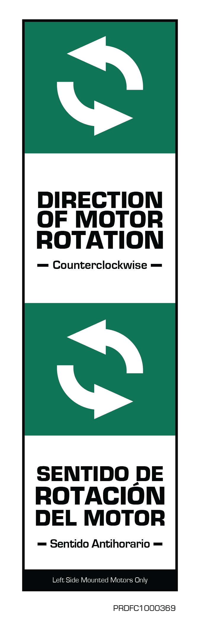
  • Safety Instructions: White text on green.

Don't

Use thin weights (Light) on safety labels. Thin strokes degrade under UV exposure and are illegible at distance.
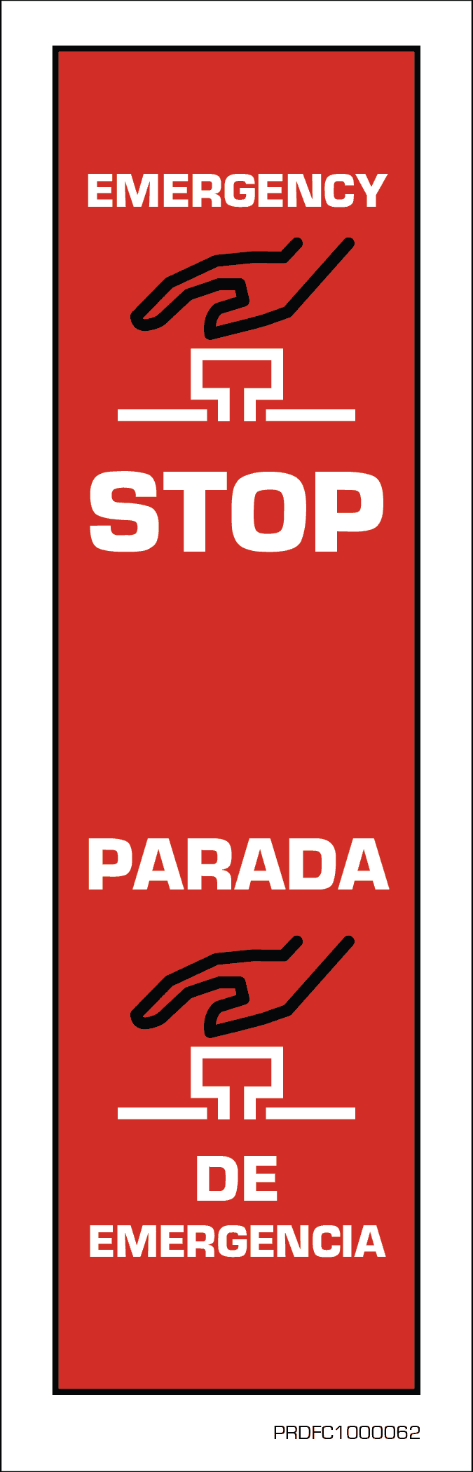
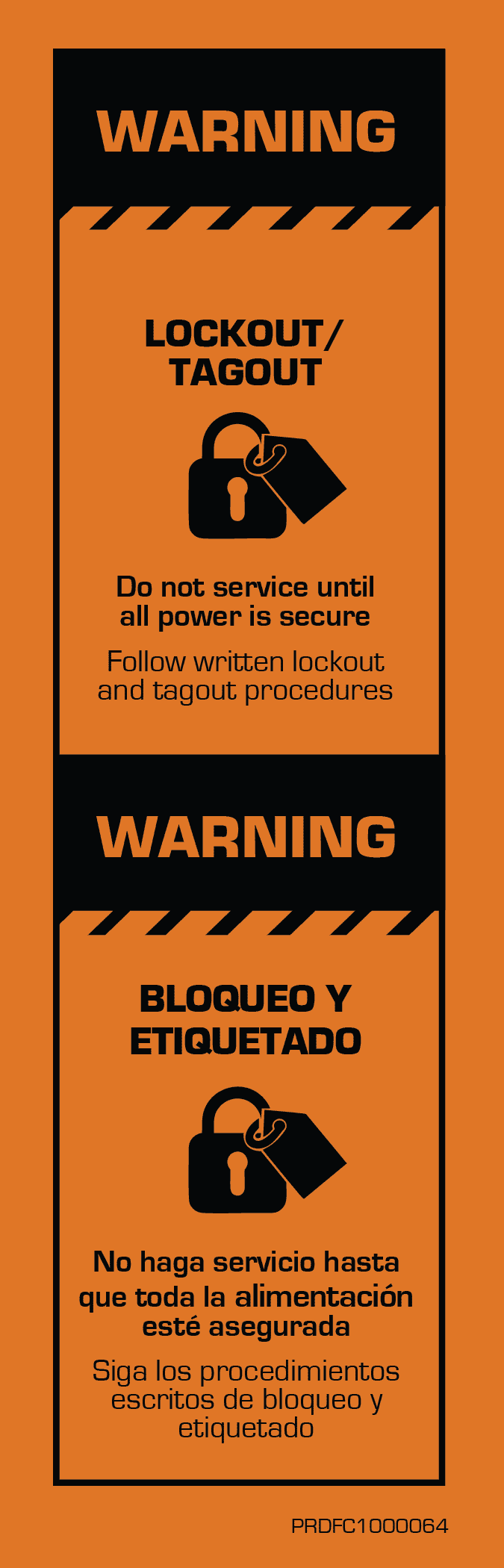
Emergency stop label
Warning tagout label
Industrial labeling

Explore Our Brand

Discover how Fluent Conveyors brings its identity to life across every touchpoint. Exploring our brand allows teams, partners, and clients to better understand how consistency, clarity, and design work together to create a unified experience across all applications.

Media

Media

Media highlights the performance, precision, and reliability of Fluent Conveyors.
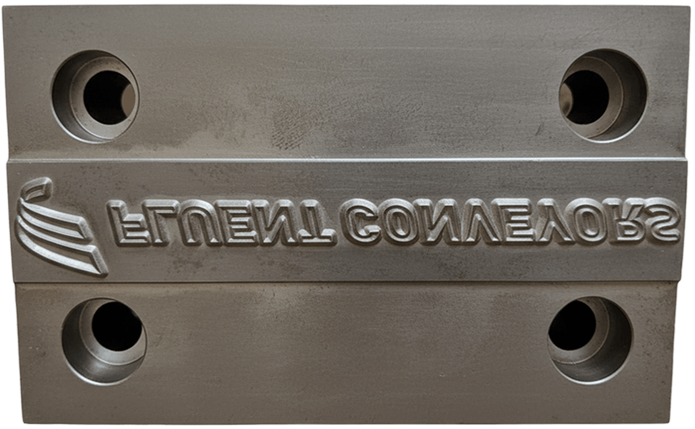
Brand Execution

Brand Execution

Consistent execution is the final, critical step in the Fluent Strategy. Every app..
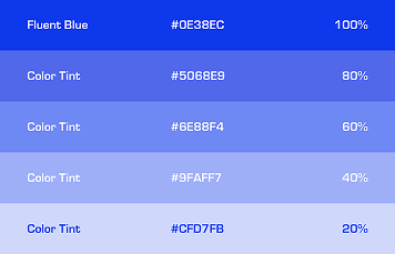
Color

Color

Our approach to color is not merely aesthetic; it is an extension of our..

Fluent conveyors footer background cover indicating manufacturing processes
Fluent Conveyors Footer Map Diagram

Copyright © 2025 Fluent Conveyors, LLC. All right reserved

Fluent Conveyors DMCA Payment

Fluent Conveyors logo is a registered trademarks of Fluent Conveyors, LLC. Serial Number 97664258 Registered on Dec. 12, 2023

Fluent Conveyors FacebookFluent Conveyors XFluent Conveyors LinkedInFluent Conveyors Youtube